About The Group

I am a member of group 2 and my candidate number is 8720. The other members of my group are Phoebe Hung (8017) and Gabriel Meytanis (8560). To see my portfolio evidence please click on the three labels on the right named: A2 Research and Planning, A2 Construction and A2 Evaluation.

This is my music video

This is my music video:

My Music Video

Digi out

This is the outside panel of my digi-pak album cover:

digi out pic

digi out pic

digi in

This is the inside panel of my digi-pak album:

digi in pic

digi in pic
This is a link to my artist website, please click on the image below to go to GiGi Official website:


Friday 2 September 2016

R&P Post 10: Album covers that have inspired and influenced my ideas

Album covers are important in the promotional package because they need to be able to catch an audience's eyes but artist identity should also be clear.

The roles of a debut album are:
  1. Showcase the artist/identity
  2. Establish the genre
  3. Be eye-catching and attract attention

From looking at a number of different album covers there are three that have really influenced and inspired my ideas. They are:
  1. DEMI- Demi Lovato
  2. 1989-  Taylor Swift
  3. Kissing to be Clever- Culture Club (original vinyl album)
Image result for demi lovato album cover
Demi Lovato Album Cover- DEMI
A key idea from DEMI that I would want to incorporate would be to have a large central image of our artist so the album cover is easily recognisable- which is also conventional of many solo artist album covers. A clear colour theme of white, grey and black may seem dull at first but stands out among the majority of album covers that are quite colourful.


Image result for taylor swift album cover 2014Image result for taylor swift album cover 1989


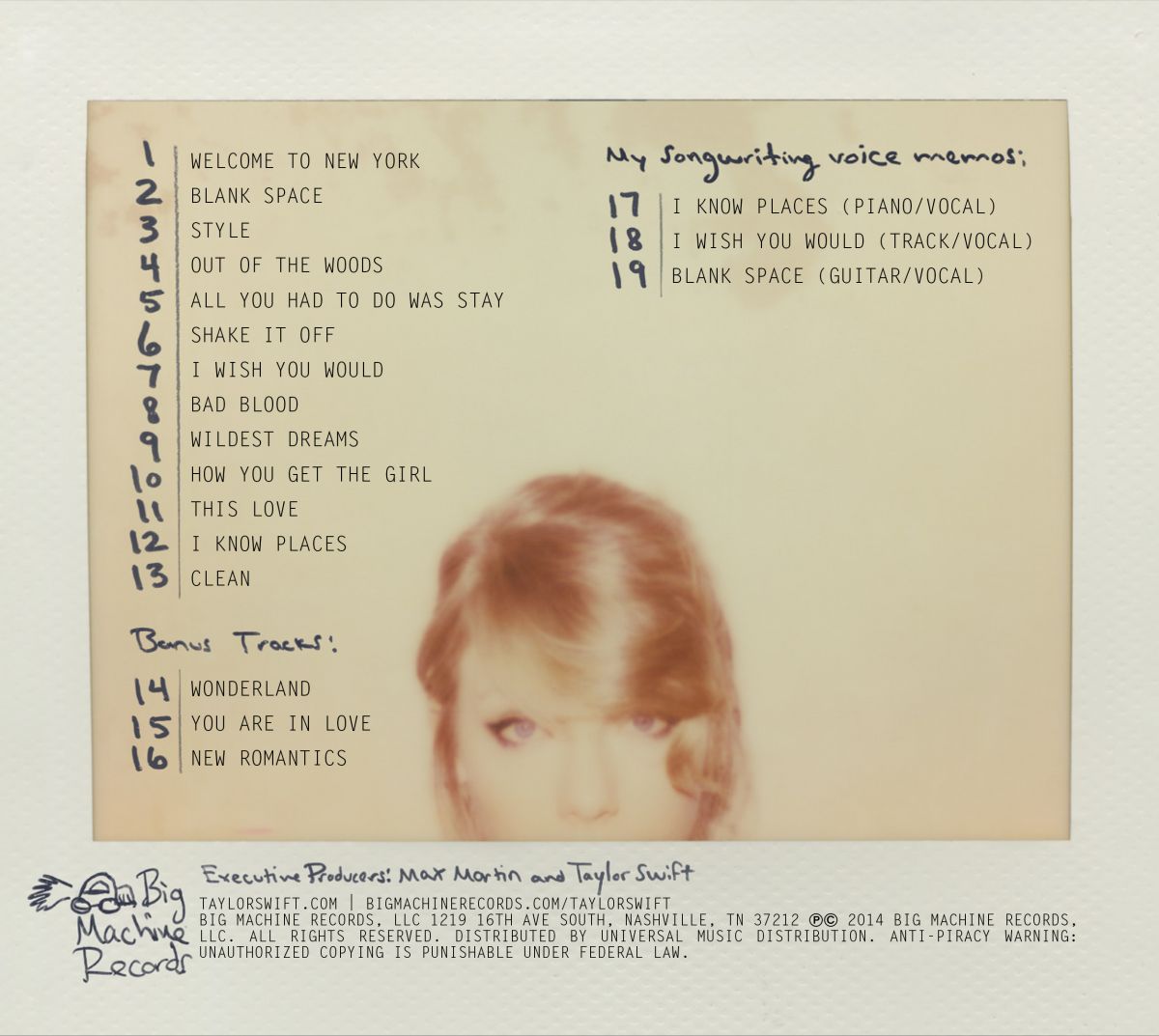
The 1989 album cover has inspired my ideas through the simplistic look of a Polaroid instant photograph. It suggests that the image could have been taken in the late 1980's but a fan would work out that it is Taylor's year of birth. I also like the use of the handwritten writing on it for the title on the front and the tracks on the back which we could possibly use in our artist's album cover to make it more personal to our artist.


Back cover
Front cover
I thought it would be interesting to look at a vinyl album cover and to see what has changed or stayed the same so I studied the vinyl which was released in 1982 by Culture Club. I like the use of the textured purple background which could be a possibility for part of our artist's album cover. The clash with the yellow font helps to make the artist and the album name stand out which is something to consider. The slanted angle of photos is not seen as much nowadays which is something we could use. However, there seems to be less focus on the songs on the album (seen through small font) and more focus on the artists that make up Culture Club.

Therefore from looking at these three different album covers I would want to include the following conventions in our four panel digi-pak album cover:
  • Large central, focal image of artist (possibly slanted)
  • Clear colour theme (possibly purple)
  • Clear font type for easy identification
  • Clear track listing on the back panel
  • Institution information and bar-code
  • Artist logo or motif
  • Contact information e.g. artist website
  • A booklet inside with extra content
  • Spine repeating the artist name and album name
Overall, studying album covers has been an important part of pre-production and will ensure that we keep our ideas for our album cover conventional of the music industry. 

No comments:

Post a Comment